






Color is key for home decor
Artists and craftspeople know that the colors they choose – and leave out – are critical ingredients in their works’ success.
Color done well is captivating. Color done badly? It’s just bad. Or drab.
Yet a color tweak might be all it takes to turn up a piece’s vibrancy and magic.
An eye for color is intuitive and learned, experts say.
Kaffe Fassett has spent a lifetime experimenting. The septuagenarian is exuberant with color in his embroidery, knitting and fabric designs. He’s known for bold florals, fruits and vegetables and geometric shapes – in sweaters, knitted coats and needlepoint.
A Londoner for 40 years who was born and raised in California, Fassett eschews conventional color rules, although he subscribes to a few intuitively.
‘Pick up one color and stick it next to another and see if you get a bounce from it, ‘ the textile artist said. ‘Colors can either dampen each other or they can light each other up. ‘
Also, stick to a color theme but make it ‘pop ‘ with little surprises of a different color. That ensures a piece won’t become muddy or drab from a color theme’s overuse.
Anna Maria Horner, a Brentwood, Tenn., fine artist turned fabric and home-decor designer, echoes some of Fassett’s tips.
‘What people overlook is arranging the light and dark – the depths of every shade, ‘ said Horner, who designs fabrics and needlework products for Westminster Fibers. ‘You can throw all the right colors into it, but maybe you don’t have the right lightness and darkness and depth of shade. ‘
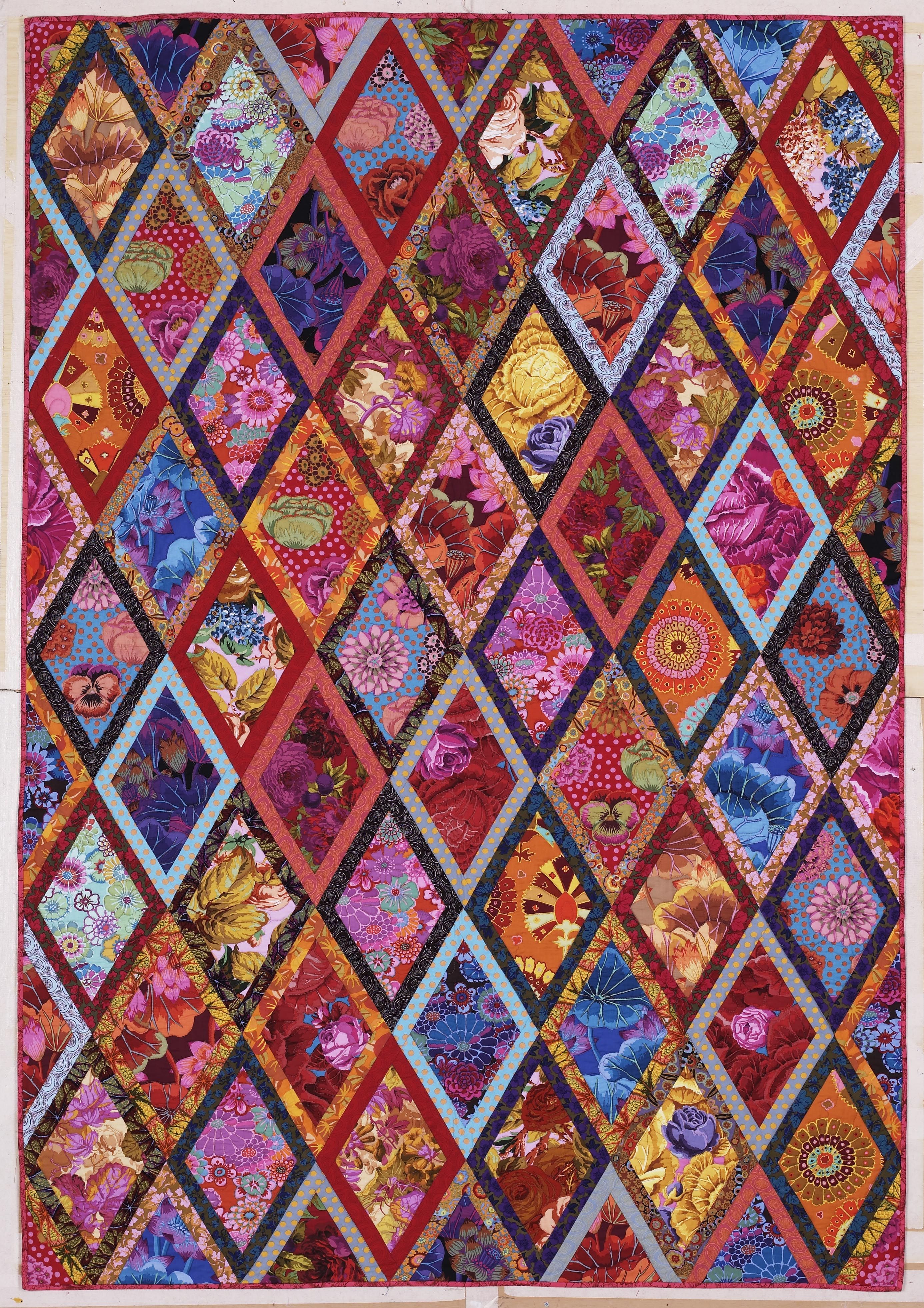
This publicity photo provided by Abrams shows The Bordered Diamonds quilt from Kaffe Fassett’s book “Simple Shapes Spectacular Quilts” (STC Craft/A Melanie Falick Book, 2010) and it also appears in his autobiography, “Kaffe Fassett: Dreaming in Color” (2012). He’s taught workshops on this quilt throughout the world. (AP Photo/Abrams, Jon Stewart)
This publicity photo provided by Abrams shows three needlepoint chairs with overblown blooms by Kaffee Fassett. Fassett uses exuberant color and bold images in his embroidery, knitting and fabric designs. (AP Photo/Abrams, Brandon Mably)
This publicity photo of Betina Fink’s oil painting, “Aspen,” (5 feet by 4 feet, 2013), demonstrates how reds, oranges and yellows, which are analogous colors (adjacent on the color wheel) get a “pop” from the addition of tints of blue-gray (blue is a complement, or opposite, of orange) and deep greens. (AP Photo/Betina Fink)